Chart Types.
Charts turn your tables into pictures — trends, comparisons and relationships jump out in a way a grid of numbers never can. They condense a lot of complex information into something you can read at a glance, so you can spot patterns, compare groups and tell the story faster.
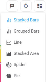
Glow gives you 6 chart types for your choice, matrix, rank and constant sum questions. To switch between them, click the chart-type icon (the four squares) above your chart on the right, then pick a type from the list:
Each type suits a different job. Here’s the quick version — the rest of this article works through an example of each:
| Chart | Reach for it when you want to… |
|---|---|
| Stacked Bars | sum the parts into a whole (the default for Matrix & Rank) |
| Grouped Bars | compare groups side by side (the default for Choice) |
| Line | track a metric over time (waves) |
| Stacked Area | sum and track over time (a hybrid) |
| Spider | compare a few measures across many items at a glance |
| Pie | show one group’s split of a whole |
1: Stacked Bars
Default for Matrix & Rank questions.
Because the bars are stacked on top of each other, it’s easy to visually sum them together. Great for when your Choices are in the table Columns and Values is set to Row %.
Example 1:
- If the segments add to 100% in your chart, it’s a Matrix single-choice question.
- If they sum to over 100%, it’s Matrix multiple-choice.
Example 2:
- “Have done before” (frequently + occasionally + once) for Domestic road trips stacks to ~78%,
- whereas for Cruises (Domestic) it stacks to just ~33%.
Sums like these are far easier to read as Stacked Bars.

2: Grouped Bars
Default for Choice questions.
Because the bars are grouped next to each other, it’s easy to see differences and compare data side by side. Perfect for when your Filters are in the table Columns and Values is set to Column %.
Example: for “Somewhat satisfied” with the checkout experience —
- Gen Z, Millennials and Gen X have the tallest bars at ~55%,
- versus Baby Boomers with the shortest at ~41%.
- (Only Millennials is statistically higher, thanks to its stronger sample size — a separate topic, covered in Significance Testing.)
That side-by-side difference is much clearer with Grouped Bars.

3: Line
Great for continuous data over time — it makes trends, changes and turning points easy to see. Ideal for showing how a metric moves across a period.
Best used when your time filters are in the table Rows (e.g. W10, W11, W12) and your choices or metrics are in the Columns. Keep the rows to time points only — a line implies a continuous trend, so mixing in non-time cuts (like Metro or Regional) would mislead.

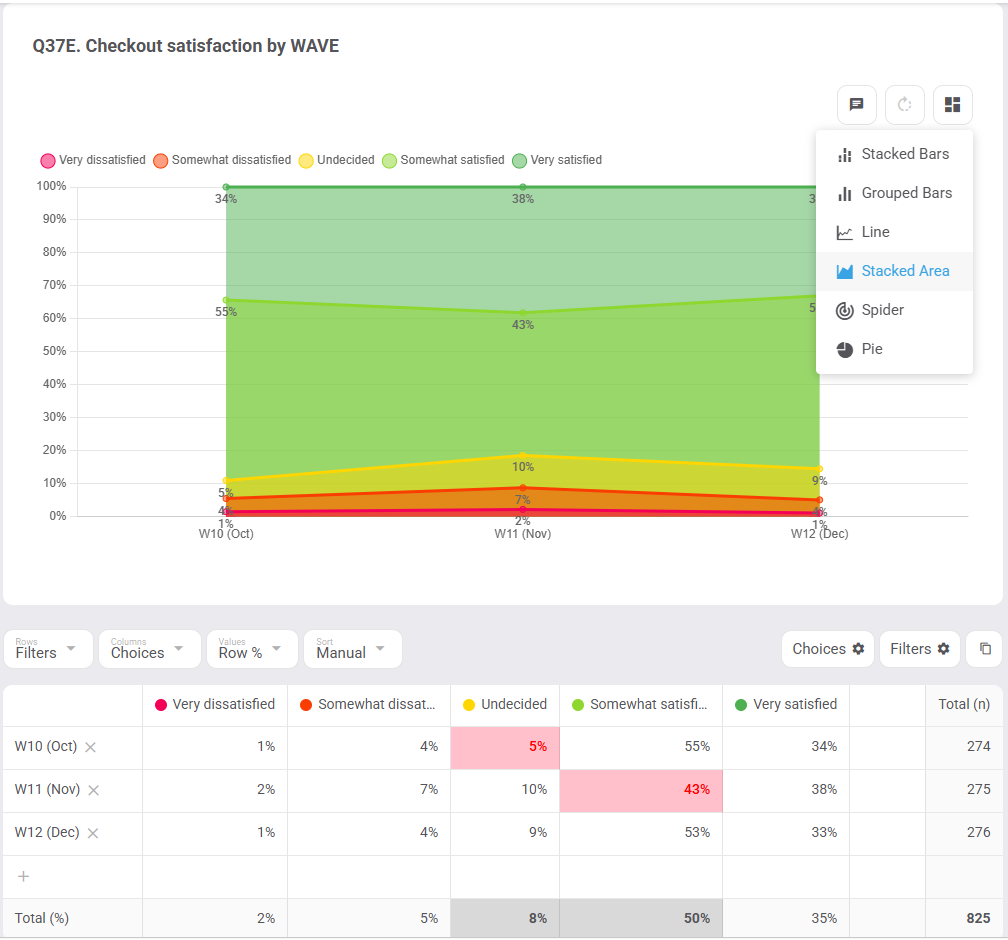
4: Stacked Area
Stacked Area charts both sum your data and track it over time — think of them as a hybrid of Stacked Bars and Line, and a great alternative to either.
Same recipe as Line (time in the Rows), but the segments fill in so you can see each part’s share change wave to wave.
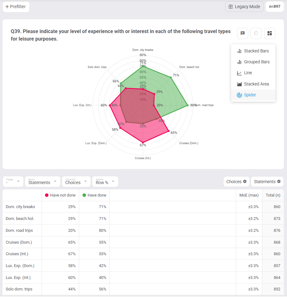
5: Spider
Maybe 1 chart in 100 will look like this — but wielded well, a Spider (radar) chart is very effective for comparing a handful of measures across many items at once.
The fewer the variables, the better. For the example below we took the travel-types matrix and simplified it:
- merged “frequently + occasionally + once” into Have done,
- merged “0 but would like to + 0 and would not” into Have not done, and
- excluded “I am not sure”.
The green shape instantly shows which travel types people have actually done.
6: Pie
A Pie chart shows one group’s split of a whole. 3 steps are required for it to work:
- Set the Chart Type to Pie
- Set the Rows slot to Filters
- Set the Values slot to Row % or Cell %
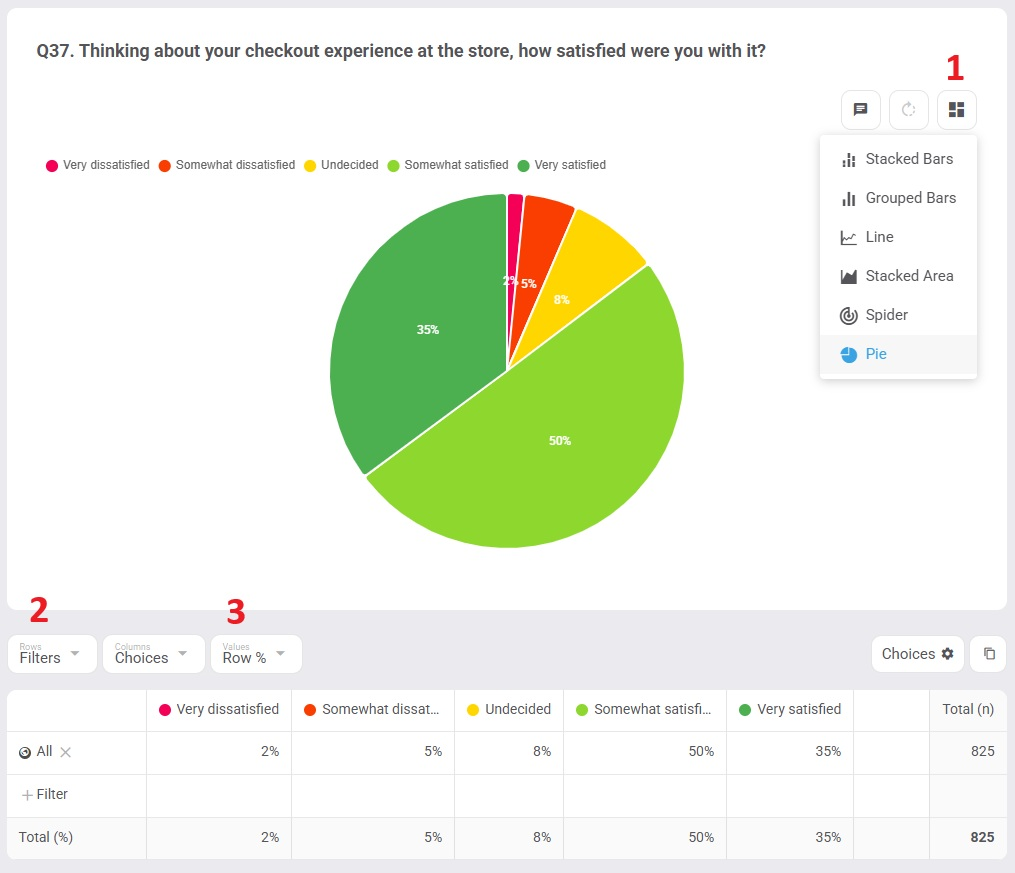
This is the only orientation that makes sense for a pie, because:
- your columns (the choices) become the pie’s slices and colours, and
- your rows (the filters) become the pie’s dimension.
One dimension (a single row) works best. Two is possible if you orient it as above, but any more and a pie stops being readable — reach for bars instead.
Happy charting! 🎉