Intro to Analysis.
AV2 is a powerful analysis dashboard that lets you instantly create sig-tested or weighted charted crosstabs & time series for choice, matrix, rank, constant sum, and looped questions across all your audience filters in stacked / grouped bar, line, area, or spider charts (and word clouds for text questions) in shareable dashboards.
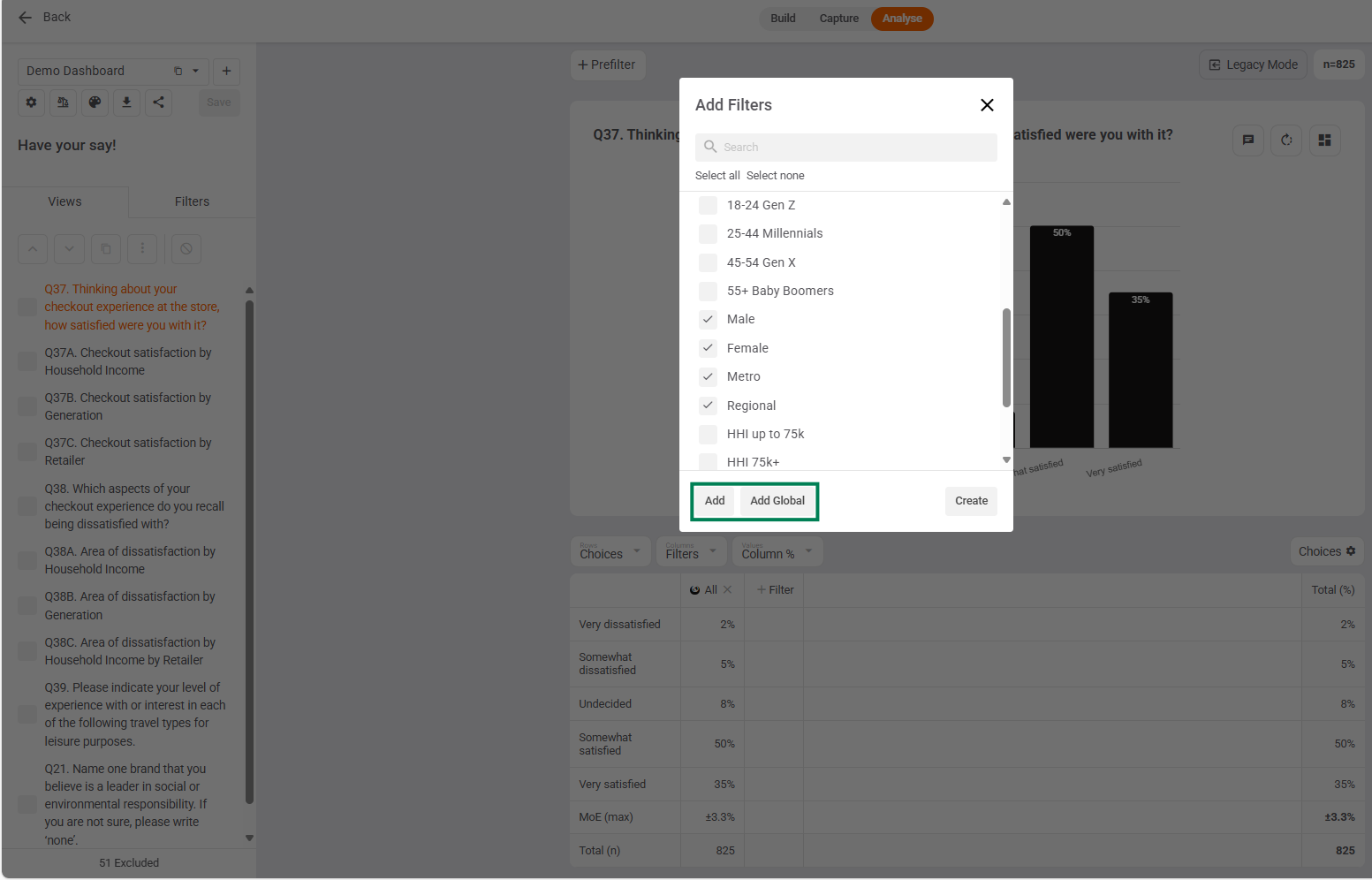
This is all driven by Filters.
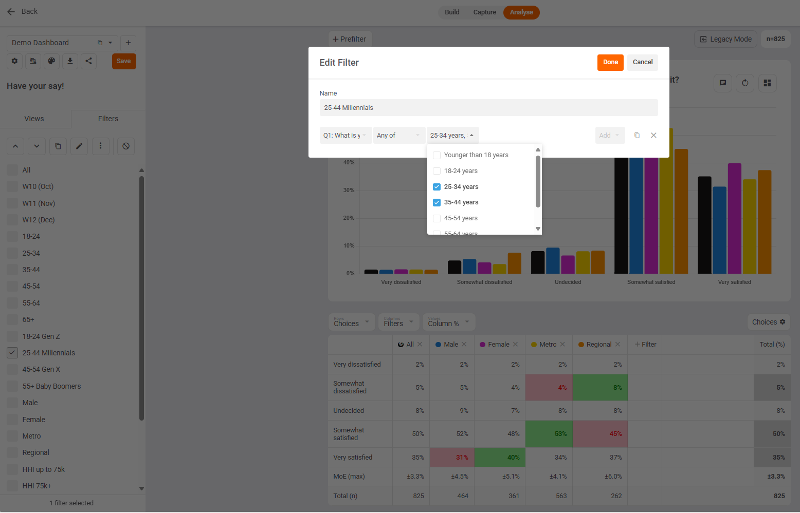
Filters are easy to create using any combination of Any of, All of, None of, Exactly, as well as AND and OR logic. E.g. here's a simple Filter for "25-44 Millennials" = Any of 25-34, 35-44 years old.
Prefilters vs. Cross Filters
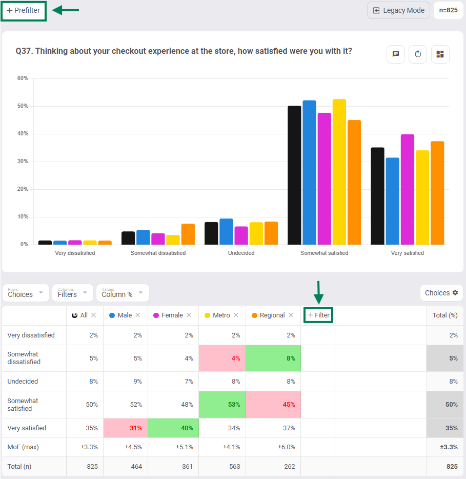
Add filters to your charts & tables as either
- Prefilters (above your chart) OR
- Cross filters (in your table columns or rows).
Prefilters refine your data
Cross filters cut your data so you can compare answers side-by-side across multiple groups (visualised crosstabs)
Local vs. Global Filters:
Add filters to your charts & tables as either:
- Local filters (Add) or
- Global filters (Add Global)
Local filters are added to / removed from only the current view. Great for analysis using duplicate views in a single dashboard.
Global filters are added to / removed from all views in the current dashboard. Great for analysis across multiple dashboards.
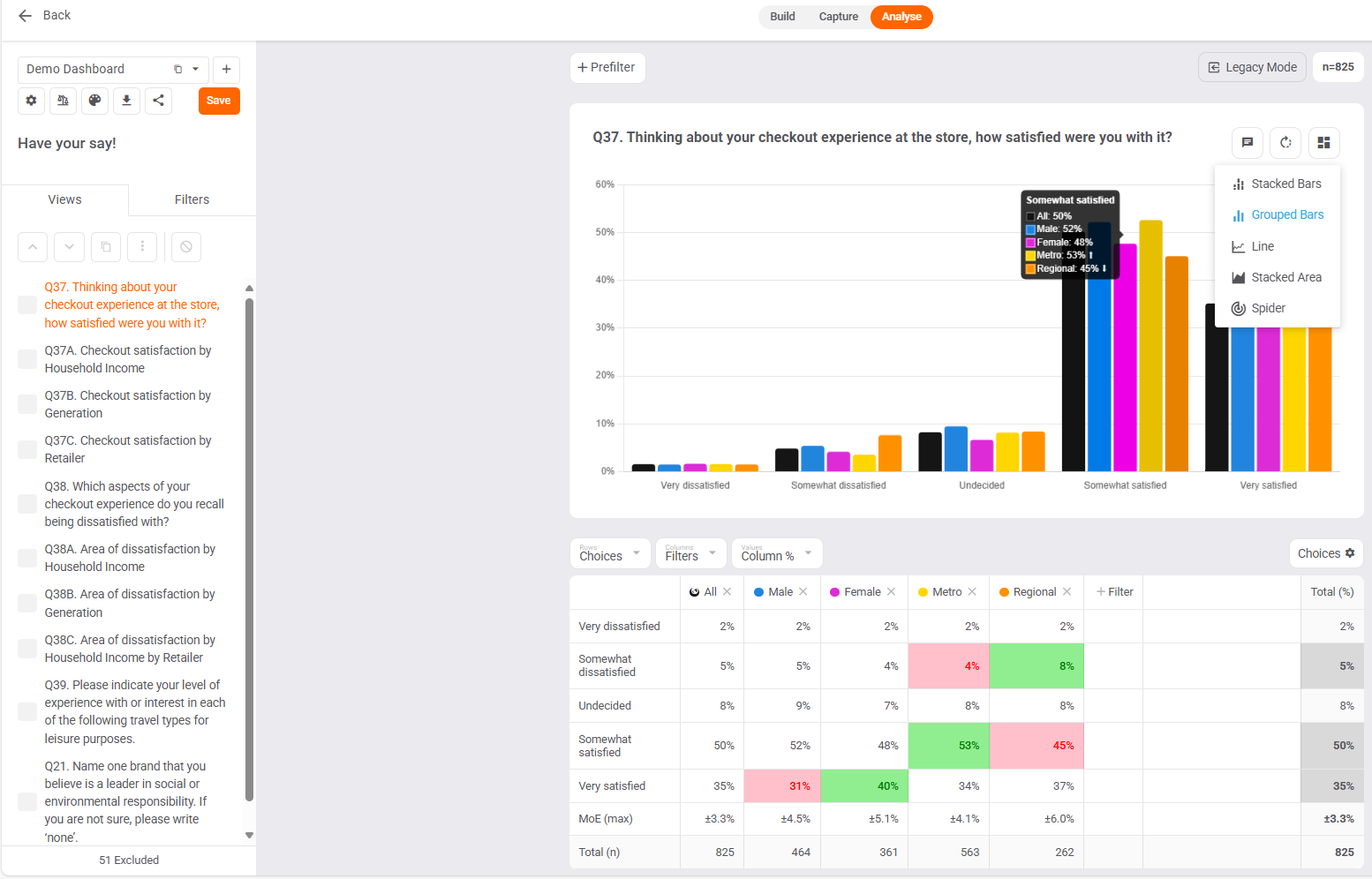
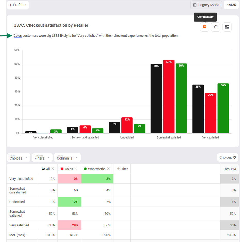
Values let you see your counts, percentages, sums, and averages for your question. Here, Column % is used because our filters are in the columns. Tip: if Filters in columns use Column %, but if Filters in rows use Row %.
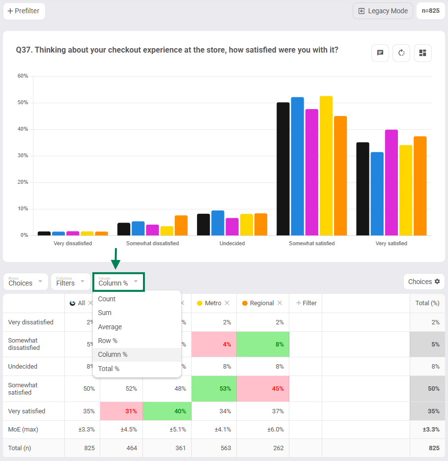
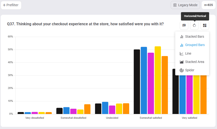
Chart Types: pick between Stacked Bars, Grouped Bars, Line, Stacked Area, and Spider charts and rotate bar charts between Horizontal (default) or Vertical views.
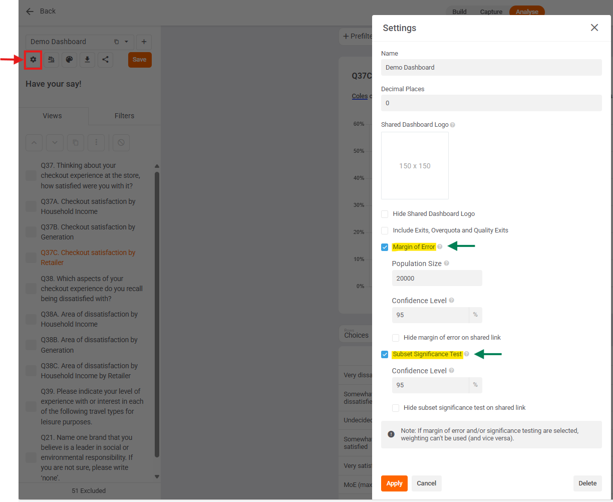
Sig-Test & Margin of Error: Conduct sig-testing by going into your dashboard settings, then tick "Subset Significance Test" and click "Apply" to highlight statistical differences. Cells that are significantly higher or lower than the total will appear as green and red cells in table / up and down arrows in chart. You can also tick "Margin of Error" to see how statistically reliable your sample sizes are in your tables. Both statistical tests are set to 95% confidence level by default.
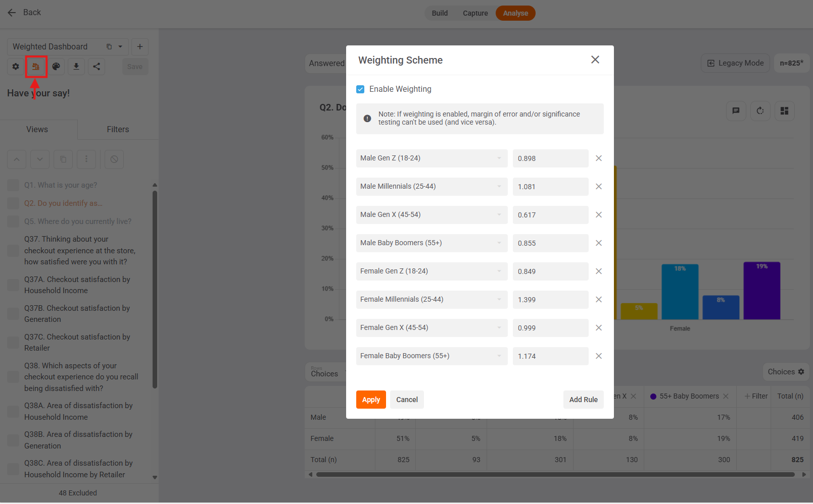
Weight your data to align with a nationally representative audience, or upweight specific segments to match your business profile, or upweight hard to reach groups.
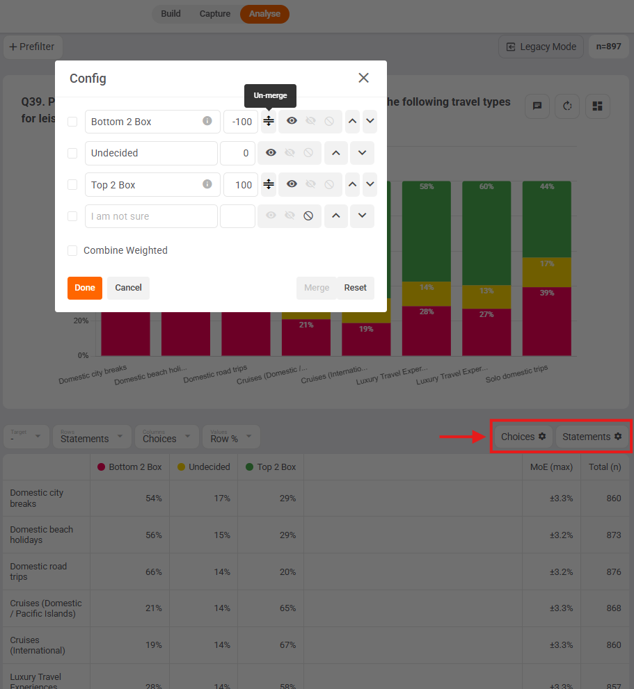
Config allows you to merge, unmerge, rename, display, hide, exclude, reorder, score, and reset choices. You can also rename, display, hide, and reorder statements, loops, and ranks.
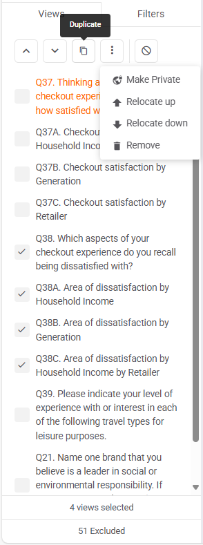
View Manager allows you to duplicate, reorder, make private, remove & restore a range of views.
Tip: click on chart title and start typing to rename that view.
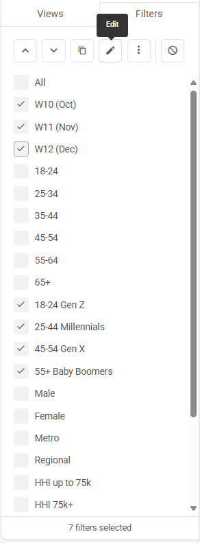
Filter Manager lets you edit, duplicate, reorder, make private, and remove multiple filters at once.
Tip: press shift on your keyboard to select/unselect a range of views / filters.
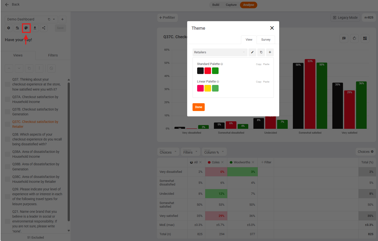
View Theme: Edit your chart colours to match your brand or theme. E.g. Woolworths green, Coles red, and All black.
View Commentary: add commentary to each of your views to help your clients and stakeholders correctly interpret their chart and table.
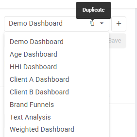
Multiple Dashboards: Create multiple custom dashboards and easily switch between them for fast, comprehensive analysis. Use dashboards to focus attention and share relevant insights with specific stakeholders
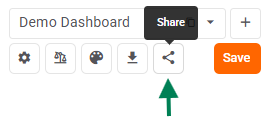
Share Analysis: Effortlessly share your analysis dashboard with your clients / stakeholders using the share dashboard link and branded with YOUR (or THEIR) logo! No login is required to access the shared dashboard.
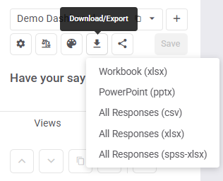
Download Views / Export Responses:
- Download your tables / crosstabs to an Excel workbook with 1 tab p/view, or
- Download your charts to PowerPoint with 1 slide p/view, or
- Export responses to csv (text), xlsx or spss-xlsx (numeric).